Case study 02 · A family business
Reilly Plumbing
Honest plumbing from a family you can trust.
A website and brand guide for a family-owned plumbing company, designed so a worried homeowner can say what’s going on and know what happens next. The brand was written down as a small design system, so the site stays consistent from phone to desktop.
A design demo with placeholder business details. The request form sends nothing.
- 16
- Color tokens
- 15
- Text styles
- 5
- Components
- 2
- Layouts

The 30-second version
The problem
Someone with a leak or a clog wants to know whether this company can help and what happens when they ask. Trade-company sites often answer with jargon and a “contact us” button.
What I did
Designed the pages for phone and desktop, then wrote the brand down as a design system: a voice, 16 color tokens, a type scale and five components, with rules for what never to do.
The result
A working demo site, built from the guide, with placeholder business details. It isn’t published for the client yet.
01 · The problem
A stressed customer, a plain question
Reilly Plumbing is a family-owned local company. People who reach the site usually have something wrong at home: a leak, a clog, a water heater that stopped. They aren’t browsing. They want to know whether this is the right company and what happens next.
The business already had its character, a family you can trust, but nothing written down to keep a site true to it.
The design works inside a few constraints:
- Real business details (phone, email, service area, license number) weren’t final, so the guide treats them as bracketed placeholders.
- Mobile first: a four-tab bottom bar below 768px, and a header with links from 768px up.
- No claims without a source: no years in business, ratings, guarantees or response times.
02 · Design system
A brand written down before the screens multiplied
Excerpts from the guide: a deep forest green with one gold accent on a warm cream ground, a serif for headings and a plain sans for everything else.
Palette: forest, one gold accent, warm neutrals
Brand fill: buttons, hero panels
Headings and the footer
The only accent, on dark grounds
Eyebrow labels on light grounds
Page ground
Active nav pill, icon circles
Type: a sturdy serif and a plain sans
- Display
- Fraunces 600, for headlines and the wordmark only
- Body
- DM Sans 16 px, for everything else
- Eyebrows
- DM Sans Bold, 13 px, capitals, in gold ink
- Scale
- Four display sizes, from 58 px on the desktop hero to 30 px on mobile titles
Voice
Write like a neighbor who happens to know plumbing: warm, plain-spoken, confident, never salesy.
- “Honest plumbing from a family you can trust.”
- “From a leaky faucet to a burst pipe, we treat your home like our own.”
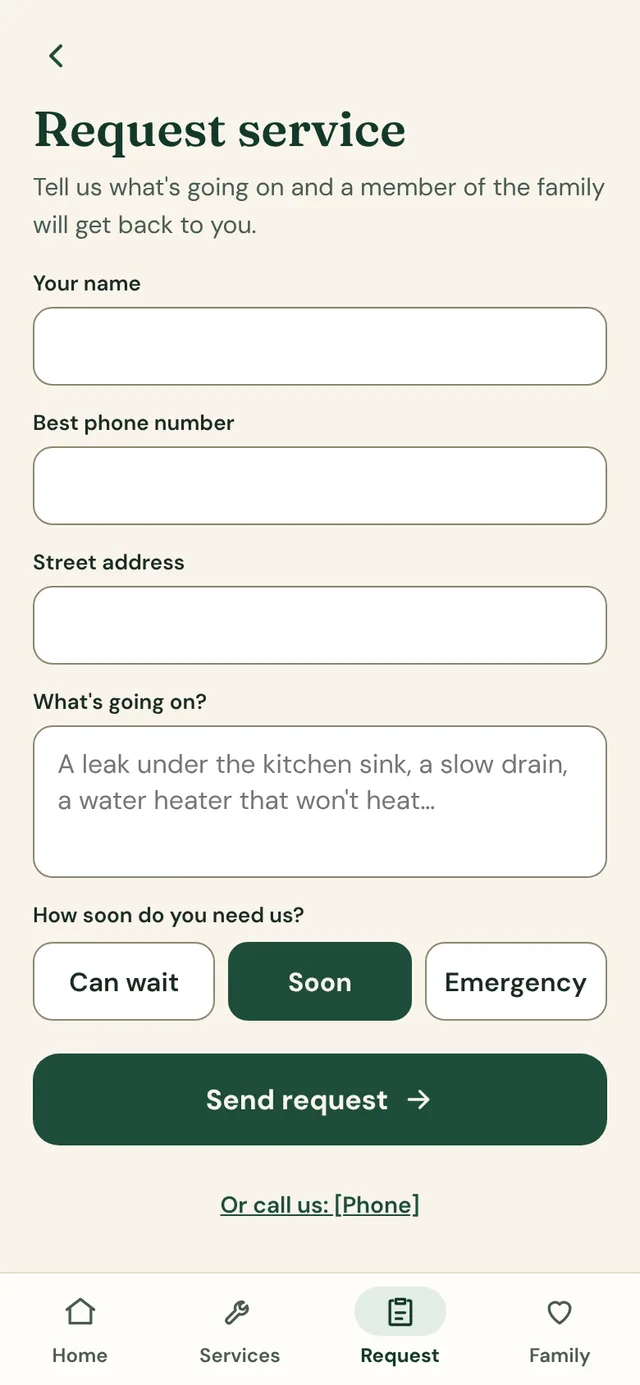
- “Tell us what’s going on.”
Rules the screens follow
- Gold is the only accent, and never text on a light ground.
- No gradients and no shadows: surfaces separate by fill or a 1 px line.
- Every tappable control is at least 44 px tall.
- Focus rings are always visible: 2 px, with a 2 px offset.
- Never invent facts: business details stay in brackets until the owner supplies them.
03 · Key decisions
The choices that shaped the system
Not a page-by-page tour. These are the calls that made the guide useful to the next person who touches the site.
Write the voice down first
Words are part of the design system
Problem
Trade-company sites tend to lean on jargon and a “contact us” button, which leaves a worried customer guessing what happens next.
Approach
The guide sets a voice (a neighbor who happens to know plumbing), asks for everyday words like “leak” and “drain,” and says what happens next instead of hiding behind “contact us.” Headings and buttons use sentence case, and an exclamation point appears only to say thanks.
Outcome
Copy that sounds like the family, and a rule a future writer can follow without asking.
Never invent facts
Honest placeholders instead of made-up claims
Problem
It’s tempting to fill a small-business site with years in business, ratings and “24/7.” If any of it is wrong, it costs the family the trust the site is selling.
Approach
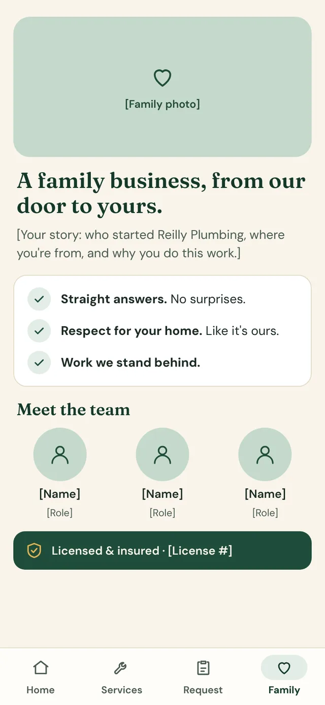
Every business detail is a bracketed placeholder until the owner supplies it: [Phone], [Cities we serve], [License #], [Family photo]. The guide forbids claims about ratings, guarantees, prices or response times without a source.
Outcome
The design could be finished without guessing, and nothing on the site can be untrue by accident.
Contrast is written into the tokens
Accessibility as a property of the system
Problem
Accessibility checked at the end is accessibility fixed late, screen by screen.
Approach
Each color token records where it may be used and the contrast it clears. Cream text on forest clears 4.5:1; gold is only for fills and small icons, so text on a light ground uses a separate gold ink; form borders use their own darker line color at about 3.7:1, and decorative lines never serve as a control border.
Outcome
A designer or developer picking a color can see whether it’s allowed there, and the accessible choice is the default one.
The phone gets its own navigation
A four-tab bar, then a header at 768px
Problem
On a phone, a header with several links and a phone number crowds the screen right when someone with a leak needs a clear next step.
Approach
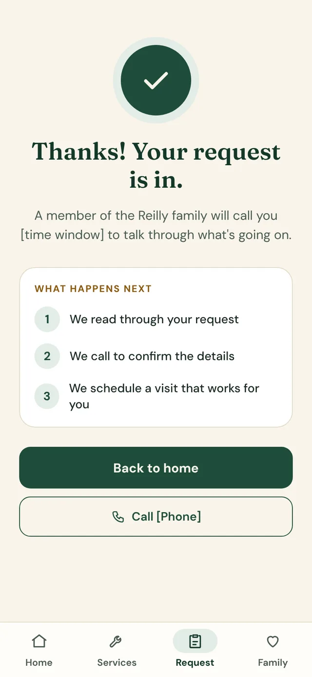
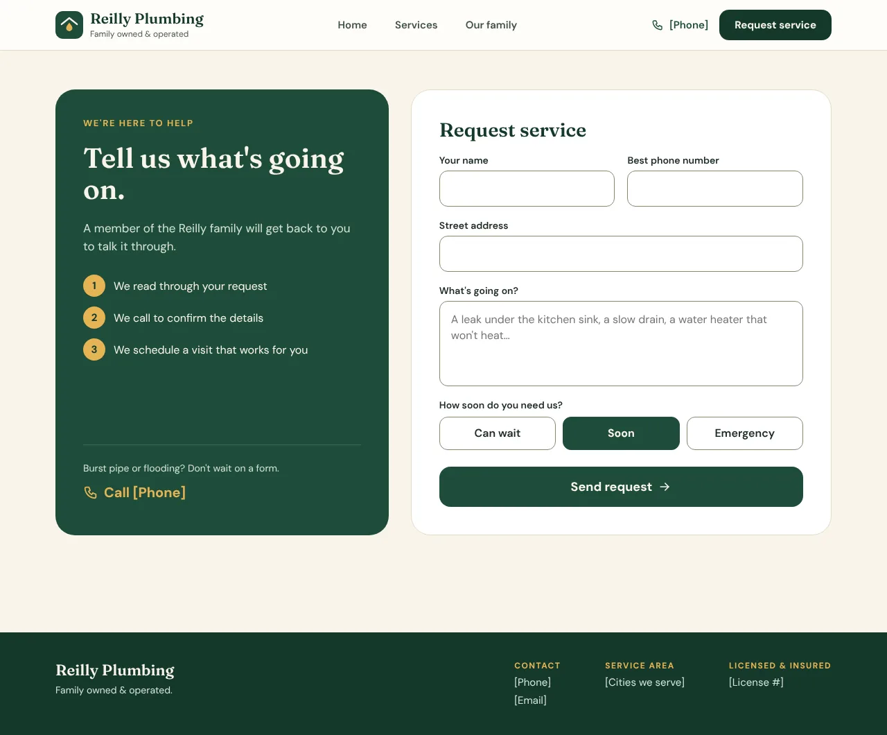
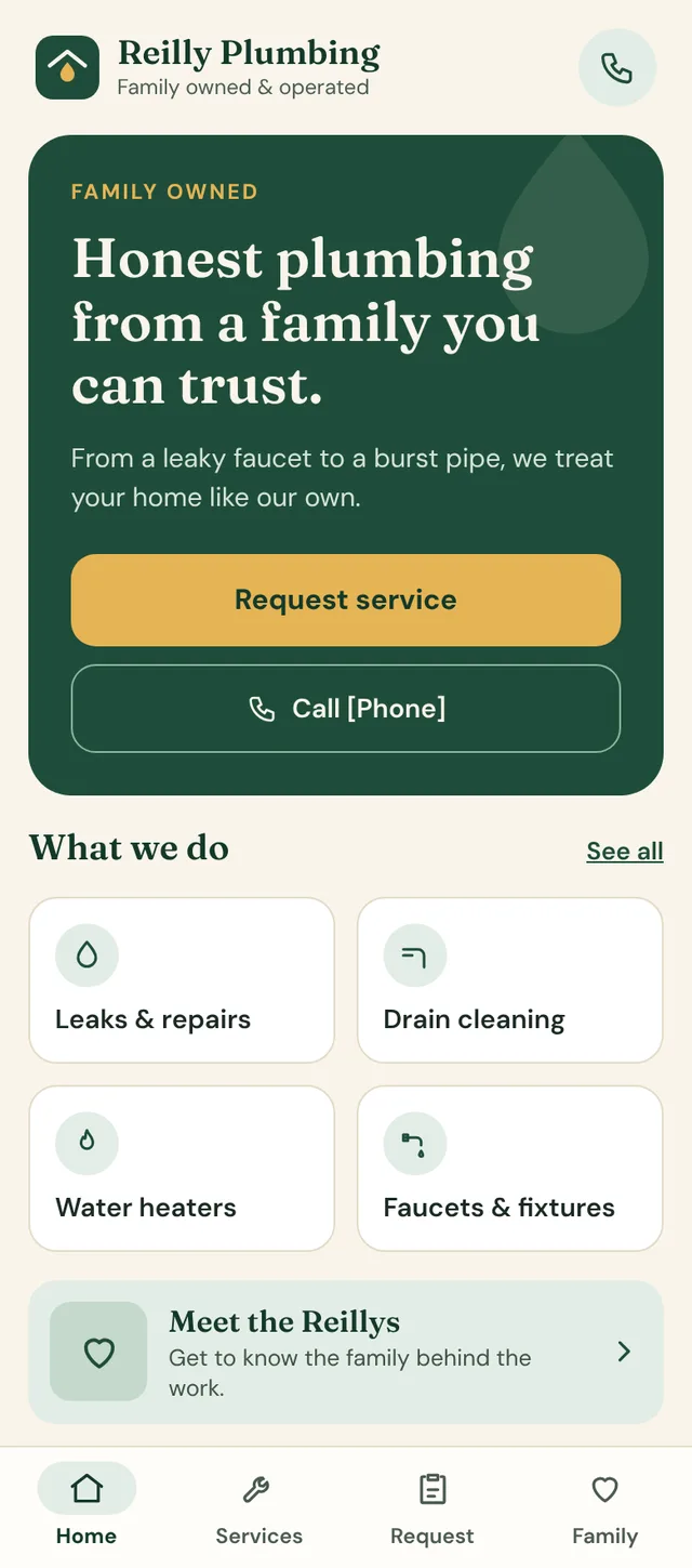
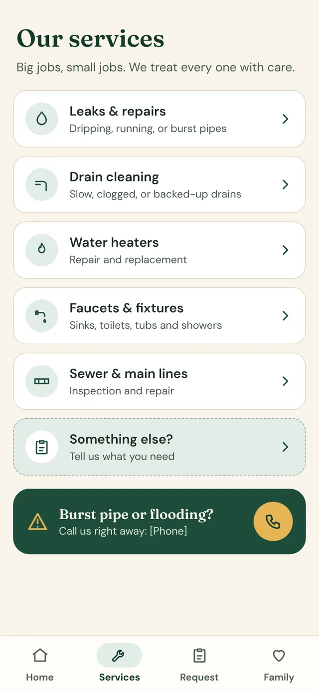
Below 768px the site uses a four-tab bottom bar: Home, Services, Request and Family. From 768px up it becomes a header with links, the phone number and one Request service button. The active tab is marked with a pill and a bolder label, never color alone.
Outcome
The most important action, asking for service, is one thumb-tap away on a phone, and the desktop version keeps the same four destinations.
04 · Process
How I worked
I started this as a favor for a family-owned local company, and built it in about a week with Claude Code.
Design the pages
I designed the mobile and desktop pages first: home, services, request service, the family and the confirmation.
Write the system down
With the screens in hand, I wrote the guide: tokens with usage notes, a voice, and five components (button, form controls, logo, navigation and service card), each with guidance and a live preview.
Build from the guide
I built the site from the guide in React and Tailwind with Claude Code, using the guide’s tokens as the theme, so the code and the guide stay in step.
05 · Outcomes
What came out of it
- A brand and design system guideTokens, voice, rules and five components, each with live previews
- Mobile and desktop layoutsDesigned for a request-service flow that ends in a clear confirmation
Honestly: The site runs as a demo, and it isn’t published for the client yet. The business details, real logo and family photos are still placeholders, and the request form sends nothing until a real backend replaces the stand-in. I started it as a favor, and what it shows is how I take a brand from a written guide to a working site.
Next project