Professional work · Previous employer
A multi-module SaaS admin console
Making a growing admin console modern, consistent and easier to use.
A multi-module SaaS tool that gives administrators one place to manage their company’s workspace. Over about four years, with one other designer and the development team, I redesigned its patterns and built the component library that keeps every module consistent.
The 30-second version
The problem
As the product grew, its patterns drifted: the same kind of task looked and behaved differently from screen to screen.
What I did
Built a two-layer component system on top of Material UI, chose one container for each kind of task and made it identical everywhere, and redesigned the most logic-heavy feature, rule creation, around how people think about rules.
The result
The product became easier to navigate and use, components became consistent, and developers could add new APIs and features without starting each screen from scratch.
01 · The problem
The same task looked different on every screen
The product gives administrators a single place to manage their company’s workspace across several modules. As it grew, each module built up its own habits, so a creation flow, a details view or a confirmation could look and behave differently depending on where you were.
The goal, shared with my design partner, was twofold: make the application more modern and easier for clients to use, and give product, design and development a more organized way of working together.
The constraints:
- A small design team: two designers, working closely with the developers.
- An existing component library (Material UI) the product already depended on, so starting over was not an option.
- A live product that kept growing, as developers added new APIs and features.
02 · Key decisions
The choices that shaped the product
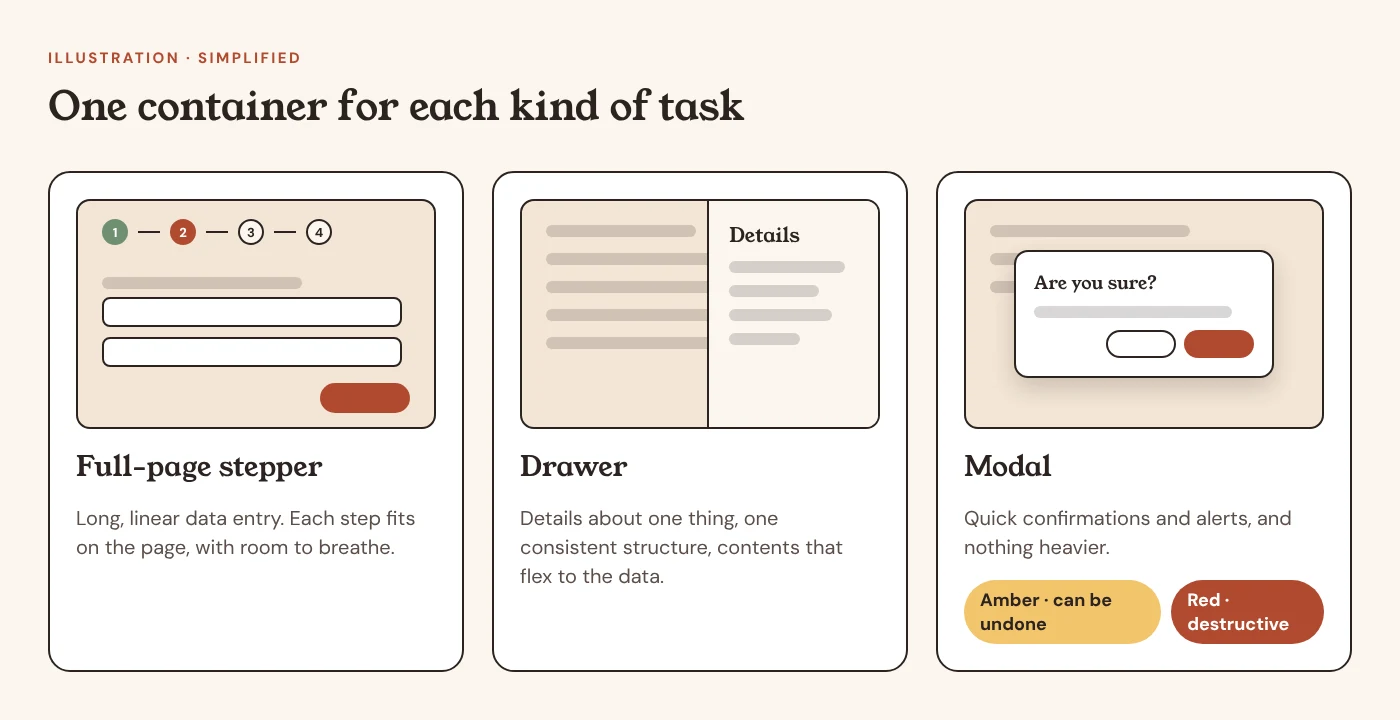
Most of the usability gains came from one idea: pick the right container for each kind of task, then make it identical everywhere. The system underneath, and one deliberate exception, complete the picture.
Two layers, not a custom library
Own what makes it distinct, keep the rest
Problem
A fully custom component library would have given total control, and a maintenance burden to match.
Approach
A two-layer system on top of Material UI. The base stays largely intact, and the product’s own token overrides sit on top. I also split the design files into three (Design System, Product and Working) so exploration never got tangled with finished work, and built a browser-based documentation hub where developers could look up real token data and component specs.
Outcome
The product keeps its own identity without the cost of maintaining a custom library, and designers and developers share one source of truth.
Full-page steppers instead of popup wizards
Give long flows room to breathe
Problem
Creation flows involve many fields. The original popup wizards couldn’t hold that much information without cramming it in or making people scroll.
Approach
I redesigned them as full-page steppers where each step fits cleanly on the page, and used the same pattern in every module.
Outcome
Long forms are easier to navigate and easier to fill in, and the experience works the same way wherever you meet it.
One drawer for details, flexible inside
Consistent structure, adaptable content
Problem
Details pages relied on modals that varied from screen to screen. The hard part of fixing that: a details view has to show very different information depending on what’s being viewed.
Approach
A single drawer pattern with one consistent structure and styling, and contents that flex within it to suit the type of data.
Outcome
Details feel familiar everywhere, and a new screen can reuse the drawer instead of inventing another modal.
Modals, but only for what they’re good at
Color that signals risk
Problem
With modals handling everything, quick confirmations and heavy tasks had been getting the same treatment.
Approach
Modals are reserved for quick confirmations and alerts. Amber marks reversible actions and red marks destructive ones, so the color itself signals how risky the action is.
Outcome
Red keeps its meaning, and people can tell at a glance how careful to be.
The rule builder breaks our own rule
A deliberate exception to the stepper
Problem
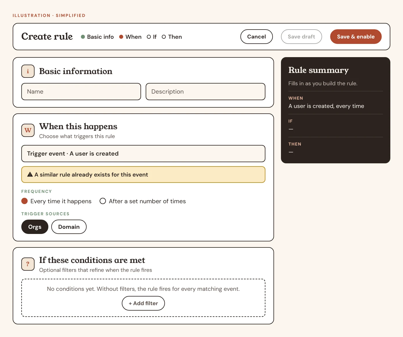
Creating a rule involves trigger logic, a Sources panel that maps events to source types, and condition blocks with AND/OR patterns. The original stepper-style wizard made people move back and forth to check how their choices fit together. A second problem was conceptual: helping users tell apart two kinds of automation, Policies (scheduled, time-driven) and the Rules Engine (real-time, event-driven), on the Automation landing page.
Approach
I redesigned it as a single page with three sections, When, If and Then, and a summary card that keeps everything set so far visible in one place. The page also warns you when a similar rule already exists for the same event. Steppers suit long, linear data entry; a rule is a set of interrelated pieces, and people need to see how they connect.
Outcome
Rules read the way people think about them: if this happens, under these conditions, do this. Users see the whole rule without navigating between steps.
03 · Process
How I worked
I worked with one other designer and the development team. When the product started I was primarily a developer, and I moved into design as it grew. Having worked on both sides shaped how I handled handoff.
Build the library, then keep it in one place
I built out the Figma component library and organized the files so a newcomer could tell what was settled and what was still exploration.
Make the system easy to look up
The documentation hub gave developers real token data and component specs in the browser, so they didn’t have to ask what a value was.
Hand off in terms developers already know
Because the patterns were consistent, tickets could point to a known component instead of describing something new each time. I also built a reusable workflow that turns Figma screens into spec docs and dev tickets, mapped against the token system.
04 · Outcomes
Outcomes and what I learned
- Easier to useConsistent steppers, drawers and components across modules
- Smoother handoffWork flowed from product to design to development with less back-and-forth
- Clearer ticketsDevelopers needed fewer clarifying questions
- Reusable piecesNew screens built from existing patterns, even as new APIs and features arrived
Honestly: I don’t have measured results to share; the gains above are what the team observed. If I did it again, I’d build the component library much earlier, before the patterns had a chance to drift. Having worked on both the development and design sides, I now see a shared library as the foundation of a design system rather than something to tidy up afterward.
Next project